
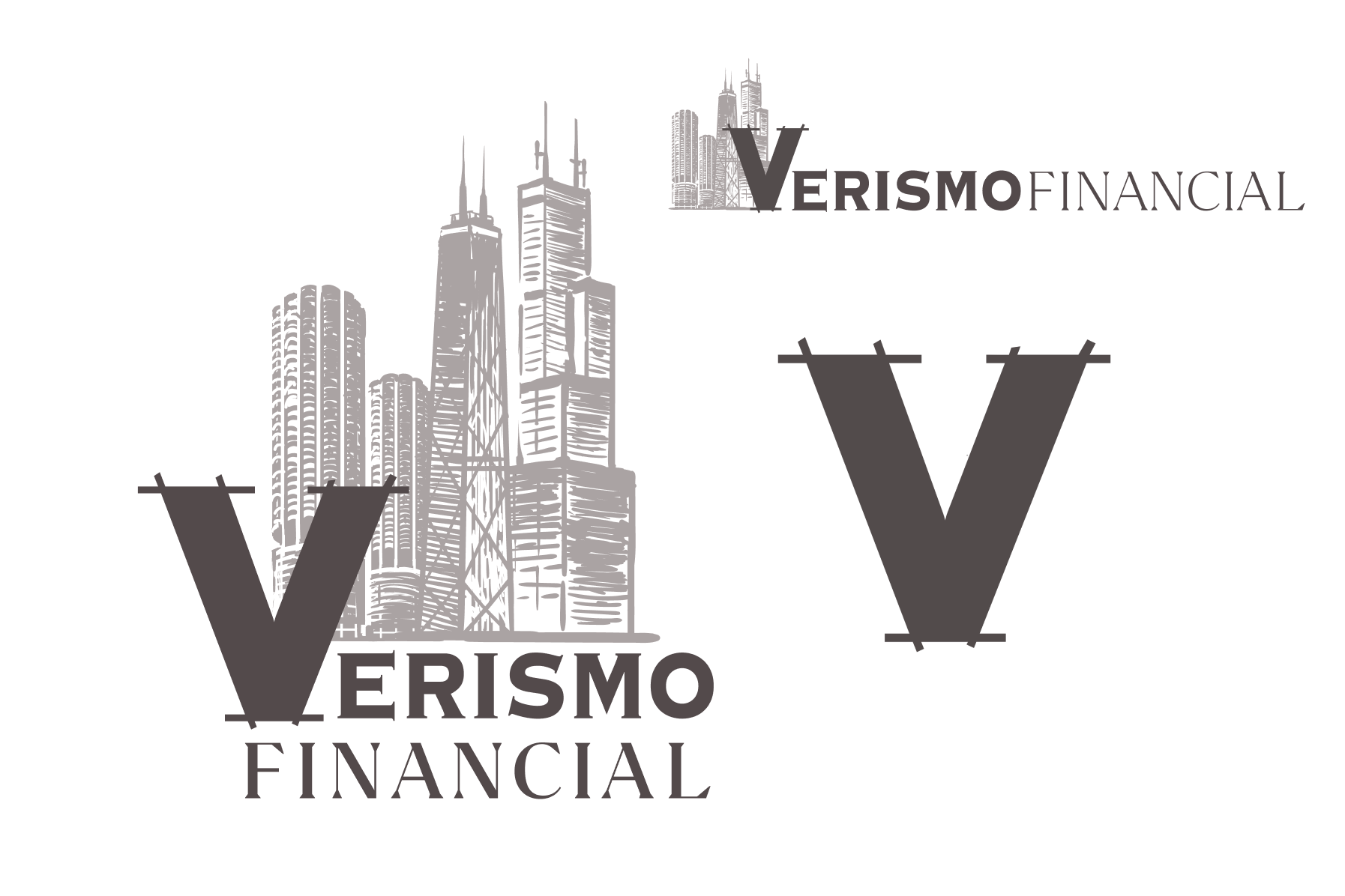

As a brand new firm prepared to open its doors, they needed a logo and the bare minimum of stationery to start business.
I was hired to come up with an identity that spoke to Chicago roots, Architectural/building as metaphor, Truth and realism, and Stability.
I created their identity, including a default vertical logo,
a horizontal alternate, and a central element of the sketched ‘V’ to be used on its own as the equity of the brand grew. I also put together a brand standards
guide to ensure tight reins of usage from the start.
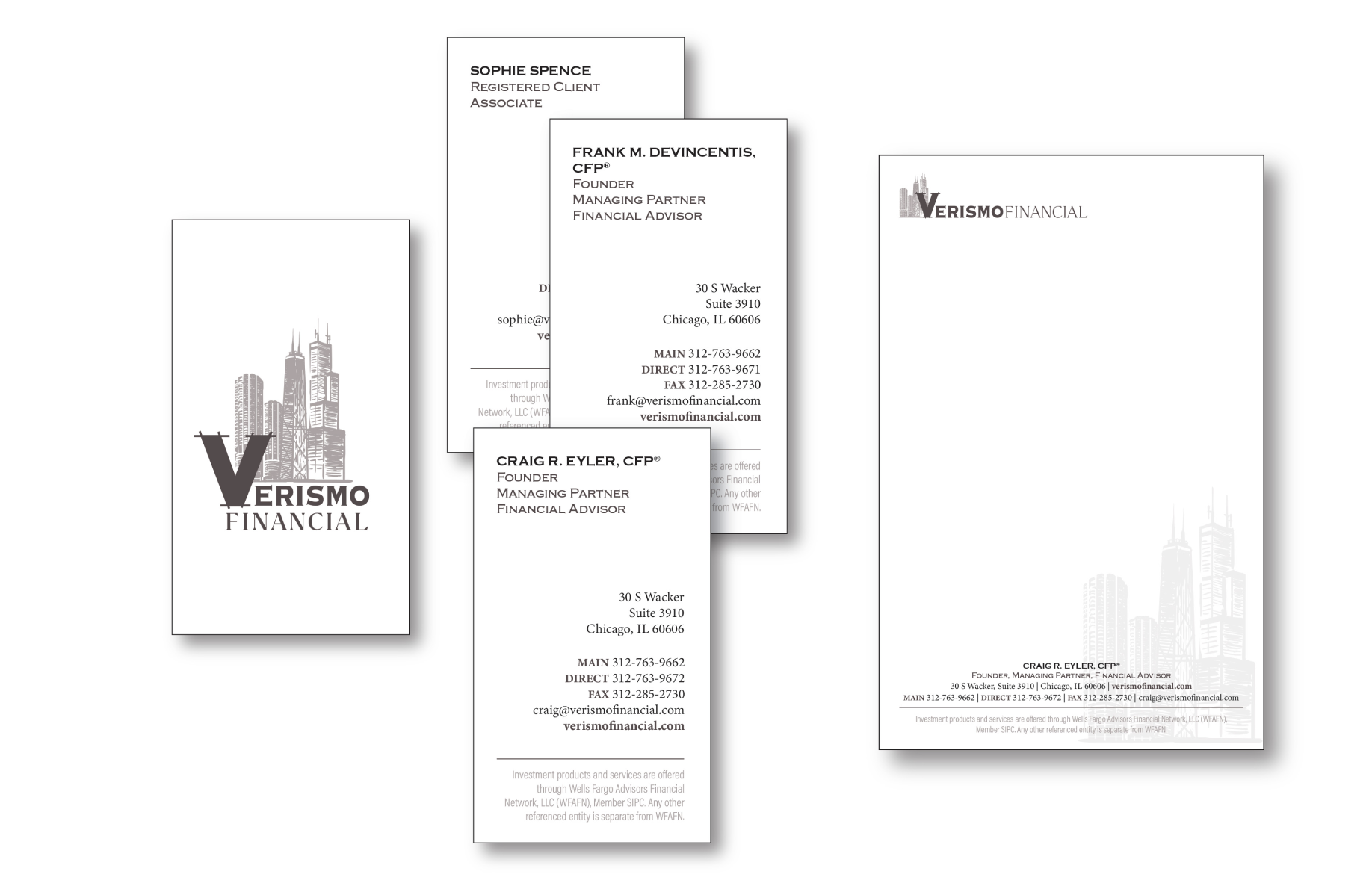
business cards and notepads
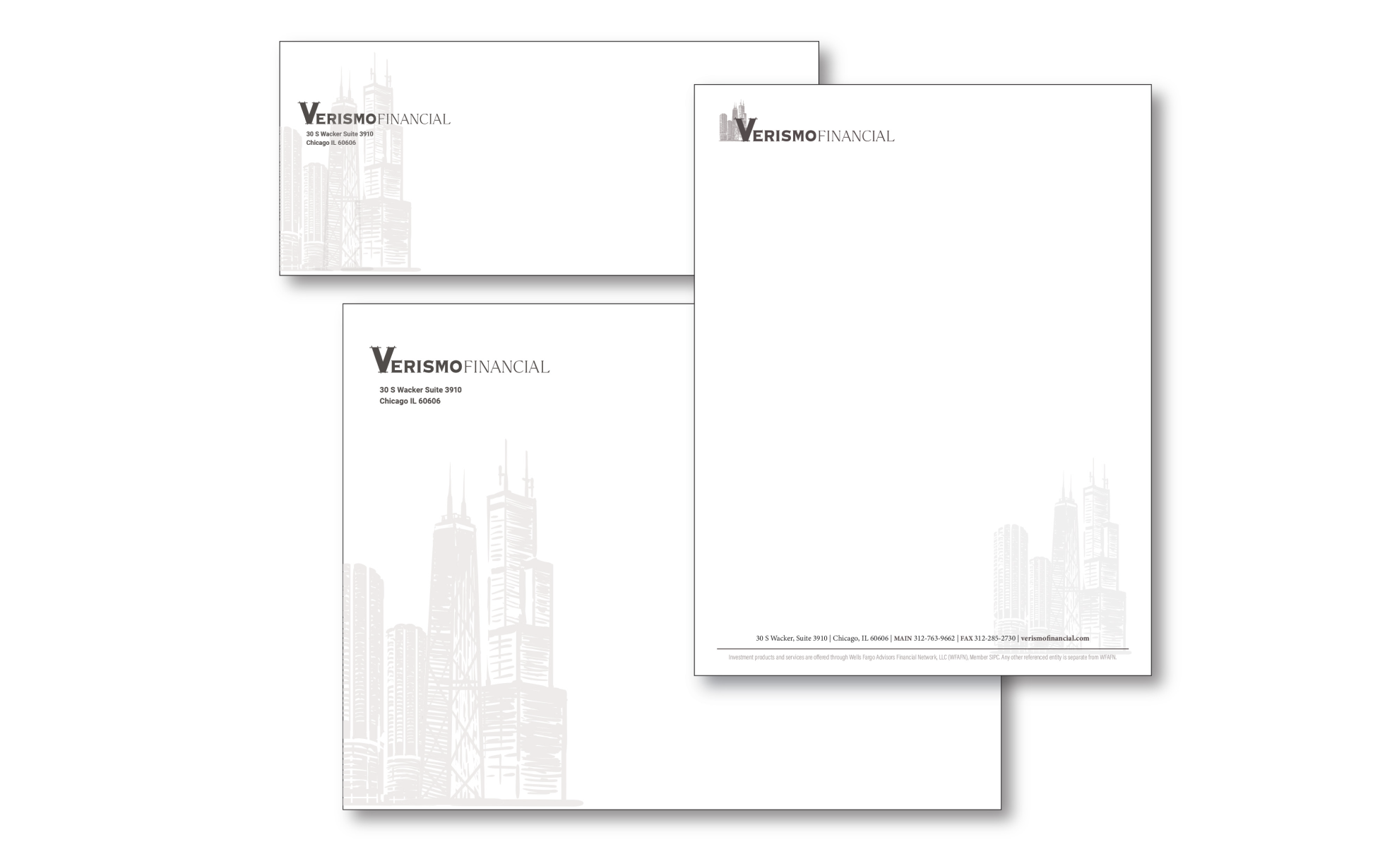
envelopes and stationery
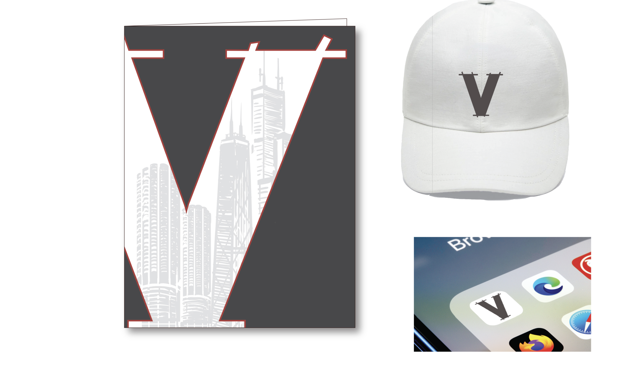
For the client folders, Verismo was interested in going with a more bold visual departure.
And no brand is complete without digital and merch looks!